 AIImageInsight
If you’ve ever tried to put readable words inside an AI-generated image, you know the struggle. Before 2024, most image models would spit out garbled nonsense where text was supposed to be. Can you imagine a majestic billboard with the phrase “Grand Opening” turned into “Gxnd Opwniwg”? That was the reality until Midjourney V6 arrived. Fast forward to 2026, and generating crisp, correctly spelled text inside scenes is almost routine—but understanding how the breakthrough happened and mastering the techniques still sets professional results apart.
Let’s rewind. The team at Midjourney tested three model versions side by side, and the outcome was crystal clear: Version 6 was the first to handle text generation without painful workarounds. If you were using an older version back then, you had to jump through flaming hoops just to get a single word right. Now, even if you’ve updated to the latest release (which you can always check by typing /settings in your Discord prompt), the core framework that V6 introduced remains the foundation.
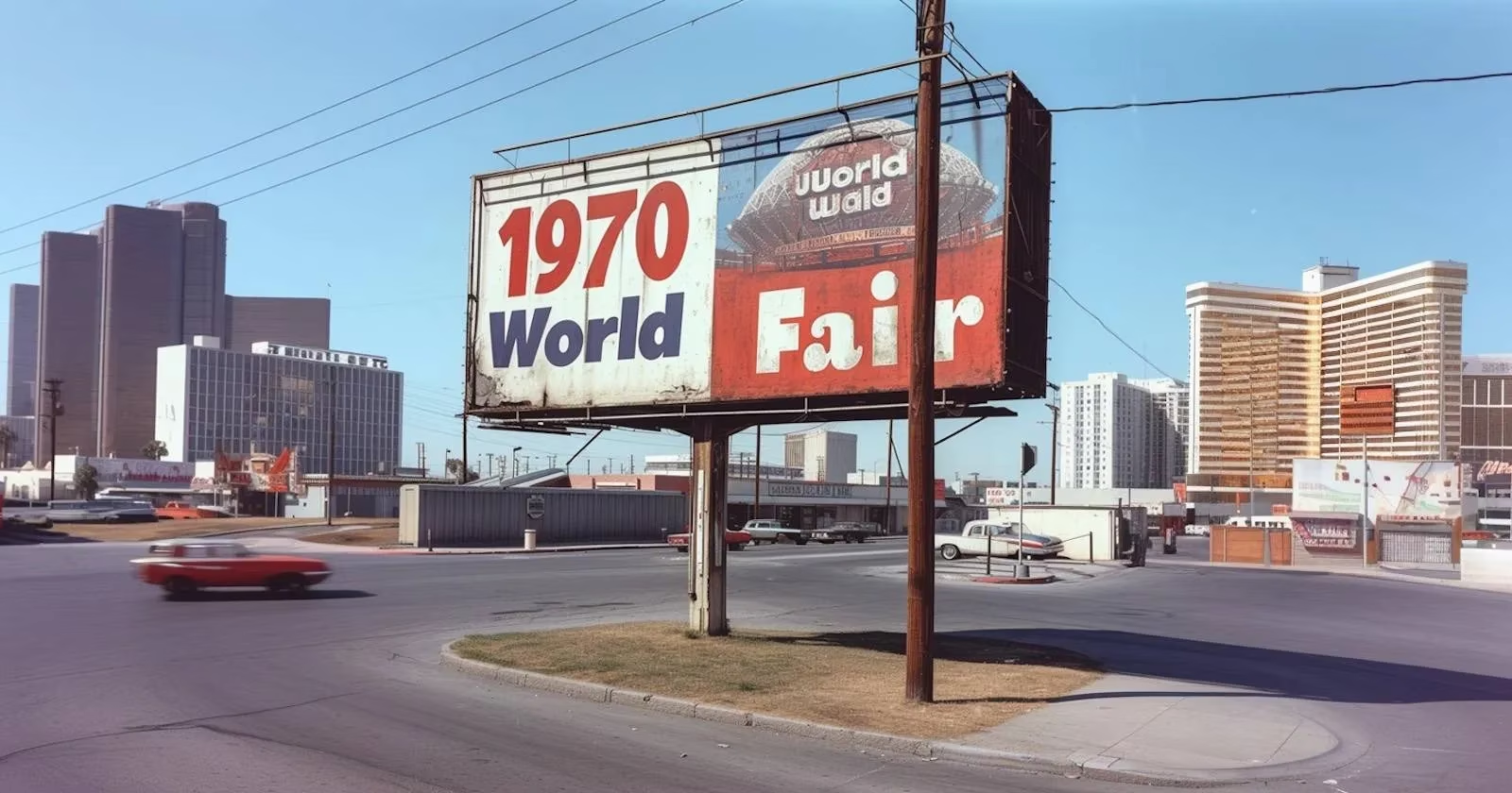
So, how does a prompt actually produce legible words? It starts with quotation marks. Any word or phrase you want to appear in the final image must be wrapped in " ". But that alone isn’t enough. The prompt also needs a logical context. Where are the words placed? How are they written? A vague instruction like “a sign that says ‘Open’” rarely works. Instead, you describe the whole scene: A retro billboard painted with the words “1970s World Fair”. By giving Midjourney that visual framework, the model understands that the quoted words belong on the billboard and that they should look painted.

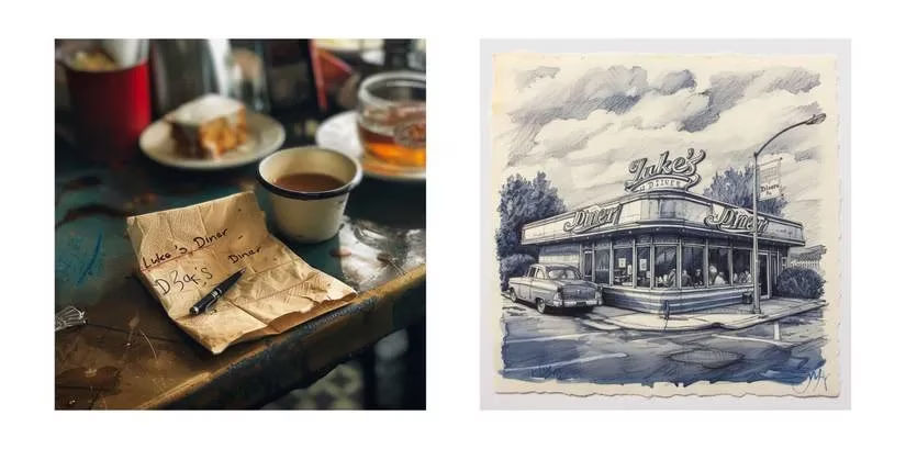
Just as important as placement is the verb you choose. The difference between “on a napkin with a pen” and “written on a napkin with a pen” might seem trivial, but it’s anything but. Without “written,” the AI might interpret the prompt as a request for an image of a napkin that is a pen, or some surreal mashup. The moment you specify how the words are applied—painted, printed, embossed, stamped, graffitied, scratched, inscribed—the meaning locks into place. Compare two near-identical prompts:
-
“Luke's Diner” on a napkin with a pen
-
“Luke's Diner” written on a napkin with a pen
The first often produces an abstract pen-and-napkin collage, while the second yields a photo of a napkin with the diner name scrawled in ink. See the shift? That one word, “written,” can rescue an entire generation.
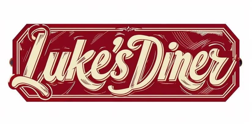
But what if you don’t want text embedded in a scene at all? What if you need a standalone logo or typographic design? That’s where the magic phrase Typography design comes in. By leading with that keyword, you step outside of a narrative scene and into graphic design territory. A prompt like:
Typography design of "Luke's Diner" written in retro red and white font --ar 2:1
tells the model to focus purely on the lettering itself. The result is a clean, stylized wordmark suitable for branding projects, posters, or even a quick social media asset.
Of course, even with these tricks, spelling mistakes still happen—especially on longer phrases. But disappointment doesn’t have to be the final word. Midjourney’s variation system is your spellchecker. After a batch of four images appears, each one has a corresponding V1, V2, V3, V4 button. Clicking a variation button re-rolls that specific image, keeping the composition while retrying the text.
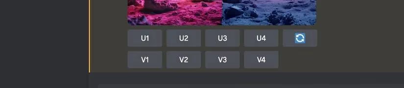
A real‑world example: imagine generating a retro billboard that reads “1970s World Fair” but the first try says “1970s Wolrd Fair.” Instead of starting over, you hit the variation button once, maybe twice, and eventually the letters snap into place while the rest of the image stays almost identical. It’s a low-effort cleanup that can salvage a near-perfect result.
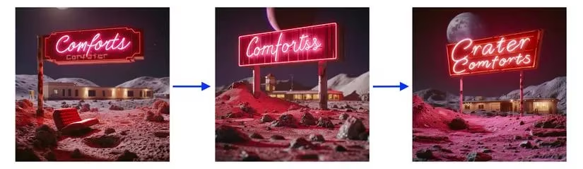
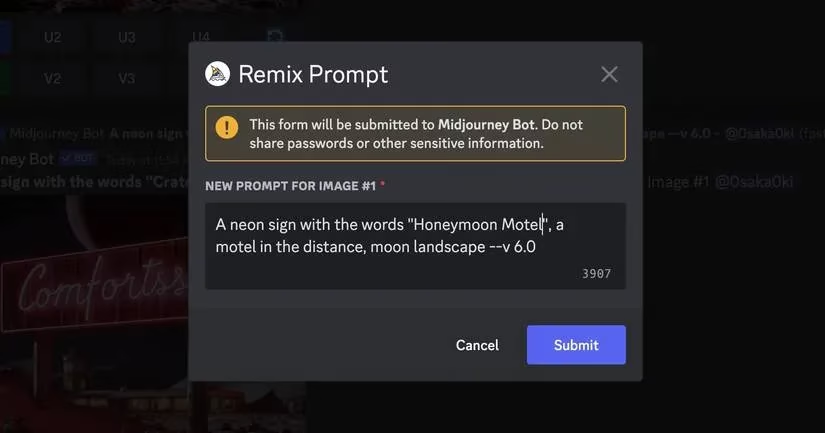
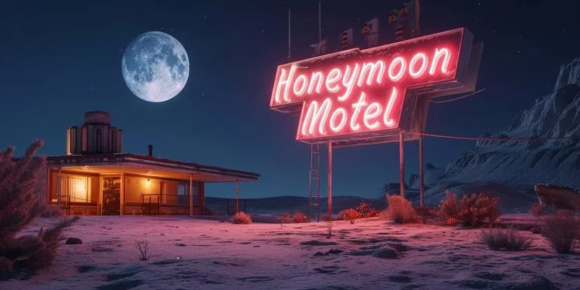
Want more control? Activate Remix mode by typing /prefer remix in the prompt box. Once it’s on, every time you click a variation button, a dialog box pops up with the original prompt ready for editing. This means you can tweak not only the text but also the description of the lettering style, the background, or the mood—all without losing the seed that gave you a promising composition. Swap out “Honeymoon Motel” for “Starlight Inn” mid-project, or dial up the neon glow while keeping the sign font. Remix mode essentially turns the variation system into a fine-tuning studio.
Statistically, short phrases win. One or two words almost always render correctly. Common phrases that fit the image’s context also outperform random nonsense. A sign reading “Honeymoon Motel” for a vintage motel scene succeeds far more often than an abstract phrase like “Crater Comforts.” The AI seems to have an easier time with words and concepts it has seen aligned in training data. So when you’re designing, lean on realism—neon signs, restaurant logos, graffiti tags, book covers—and keep the text snappy.
Fast forward to 2026: the principles born with Midjourney V6 have only grown stronger. Newer model versions continue to refine text generation, ironing out those doubled words and off‑by‑one letter errors almost entirely. However, the core framework—quoting your text, describing how it appears, using targeted adjectives, leveraging variations, and enabling Remix—remains the playbook for anyone serious about precision imagery. Whether you’re creating an AI self‑portrait with a meaningful caption, a product mockup, or an atmospheric movie still, these techniques ensure that the words on screen say exactly what you intended.
It’s easy to get frustrated when the first output misspells a crucial word, but remember: Midjourney turned a corner with V6 and has never looked back. By treating the process as an iterative dialogue—describe, generate, vary, remix—you turn a potential weakness into a creative strength. So the next time you need “Grand Opening” to actually read “Grand Opening,” will you settle for garbled letters? Or will you take control and make every word count?
Comments